Why You Should Use Email Marketing to Promote Your Membership Website
By Jeanne Berg
September 14, 2023
One of the most effective strategies to connect with your potential customers is through email marketing. By harnessing the power of well-crafted emails, you can not only promote your membership website but also engage with your members, drive conversions and foster lasting relationships.
In an age where social media often takes the limelight, it's essential to recognise that email marketing remains a steadfast and compelling strategy that delivers results. We've highlighted six of it strengths:
1. Targeted communication
Email marketing lets you to send personalised messages to your audience. You can segment your email list based on demographics, interests, or behavior, ensuring that your messages are relevant and engaging for each group. This targeted approach increases the chances of members engaging with your content and offers.
2. Building relationships
Email marketing fosters a sense of community and trust among your audience. Regularly sending valuable content, updates and exclusive offers through emails helps build a strong relationship with your audience. By consistently providing value, you can strengthen member loyalty and encourage them to remain active subscribers.
3. Cost-effective promotion
Email marketing is a cost-effective way to promote your membership website compared to traditional advertising methods because it targets an audience that has already demonstrated an interest in your product. They may have visited your website, read your content or interacted with your brand in some way, indicating that they are already engaged with your niche or product.
Because subscribers to your email list have already given their consent, they are more receptive to hearing from you.
Email marketing lets you reach a large audience without the high costs associated with paid advertising on social platforms. You also have the ability to automate your campaigns, saving time and resources.
4. Member retention and upselling
Email marketing is an effective tool for member retention and upselling. You can send renewal reminders, anniversary offers, or recommend additional premium services or products to your existing members. This proactive approach helps retain members and can increase their lifetime value to your membership website.
5. Higher conversion rates
Since your email list consists of individuals who have willingly expressed interest, they are more likely to convert. Whether it's making a purchase, signing up for a membership, or taking some other desired action, engaged subscribers are more inclined to follow through on your calls to action.
6. Measurable results
Email marketing platforms provide valuable analytics and reporting tools that allow you to track the performance of your campaigns. You can monitor open rates, click-through rates, conversion rates, and more. These insights enable you to fine-tune your email marketing strategy, optimising it for better results over time.
In conclusion
Email marketing is a powerful tool for promoting your membership website because it enables targeted communication with an interested audience. This targeted approach, combined with the trust you've built, significantly enhances the likelihood of achieving your marketing goals and successfully growing your membership website.
It's time to build your membership website
Book a demo and see everything that's possible with SubHub.
As part of the SubHub team, I've been helping people build, grow and manage their membership websites for over eight years. I've written blogs about a variety of topics but particularly enjoy writing about web design. Though I'm a native New Yorker, I live in the United Kingdom and am raising two sons who speak with British accents. Outside work, I'm a dedicated volunteer gardener at my local park, countryside rambler and secret K-drama fan.
For many online businesses, the most valuable asset they have is their mailing list.
Email marketing remains one of the most effective ways to connect with and nurture an interested audience and drive business growth. The key to success lies in the quality of your mailing list. A valuable mailing list is not just about quantity but also about the quality of your subscribers.
In this checklist, we provide insights and actionable tips to help you build a valuable list with an engaged subscriber base.
Best practices to building your mailing list
Think about how you will use the list.
Make sure you have an opt-in box: it’s the law.
Don't place restrictions on the data you collect: for example if you say, ‘sign-up for a monthly newsletter’, you can only send a monthly newsletter. If you say ‘sign up to regularly receive tips and offers’ you can send emails as frequently as you want.
Give your visitors a good reason to hand over their personal information: give value to get value.
Give away a free resource: a free ebook, discount voucher, video or anything else with a low cost to you and a high perceived value to your prospect.
Make it easy for visitors to sign up: ask for the minimum information you need, which is usually name and email address. The more information you ask for, the fewer sign-ups you will get.
Highlight your privacy policy: next to every place where you ask for customer data you should have a link to your privacy policy and a statement like ‘we take your privacy seriously’.
Have a refer a friend option: there is no better time to ask people for referrals than at the point when they have just signed up for your list.
Deliver quality, valuable content to your email list subscribers
Remind email recipient that they have given you their permission to correspond with them.
Think carefully about the subject line: it will determine how many of your emails are opened.
Make sure every message you send is relevant and valuable: always ask yourself “How will this information help my audience?” Will it make them money, save them money, make them healthier, or thinner, or wiser?
Give enough information in the email to deliver value: but don’t give away all the information. Link to your website for the full story.
Develop a consistent voice and personality for all correspondence.
Don’t send too many emails.
Don’t send too few emails.
Strategies to maintain your email list
Reward loyalty.
Stay legal: you must allow people to unsubscribe (but always ask them why they are leaving).
Study unsubscribe rates to try to reduce them.
Remember it’s not size that matters! The most valuable lists are the ones with highly engaged recipients. They open a lot of emails and they take action.
Get more information over time – every bit of information you get from recipients increases a lists value.
Prune your list: if some recipients never open your email, try to re-engage. If that fails ‘re-permission’ them to see if they still want to receive your correspondence . . . if they don’t opt back in, remove them.
Never abuse your list.
Never sell your list, unless you have got permission from the recipients, to pass it on to third parties.
Nurture and care for your list. Help it to grow and flourish. It is your future success and prosperity.
In conclusion
A high-quality mailing list is the foundation upon which you can forge lasting connections with your audience, drive engagement and achieve your marketing goals. By focusing on the acquisition of genuinely interested subscribers, maintaining their trust and delivering relevant content, you can ensure that your mailing list remains a valuable marketing asset.
It's time to build your membership website
Book a demo and see everything that's possible with SubHub.
Email marketing is a is still considered the superpower of marketing tools for any business, but it can be especially effective if you’re running a membership website. Here are 6 ways to use email marketing to boost engagement and retention in your membership business.
Welcoming new members
An initial email to welcome new members is an opportunity to set expectations, provide important information, and get members excited about being a part of your community. More than a confirmation email, a welcome email gives you the opportunity to provide more information and an expanded welcome message, which often has the effect of feeling like a personal welcome from you, rather than a simple acknowledgement. Here are some tips for making the most of your welcome email:
Make it a personalized greeting: Who doesn’t like to read their own name on an email? Take this opportunity to begin by acknowledging that you know who you’re talking to, rather than just launching into your content with no salutation. Addressing the new member by name will help to establish a personal connection and make the email feel more engaging.
Provide an overview of the community: Provide new members with a brief overview of what your community is all about, including its mission, values, and key features. This should reiterate the information on your website so the member is reassured they have signed up for the right program.
Offer key resource information: Make sure new members know how to access any resources that are available to them as members. Your confirmation email will have let members know generally how to access membership content but don’t assume your member is willing to check back into that email. Your welcome email is a chance to give them everything they need to know to access the content they just signed up for.
Inform about upcoming events: If you have any upcoming events that new members can attend, include information on these in your welcome email. This will help to get new members excited about being a part of your community and provide them with an opportunity to connect with other members.
Include a call to action: Include one primary call to action in your welcome email. Try to avoid sending new members somewhere other than your website to start, such as to join a social media group. This might be confusing if it drops them into a group with other members at very different experience levels.
You're better off to promote your website with a call to action that takes them directly to the web page that is referenced in the link, whether it's a sign-up page for a welcome package, or a calendar page to book a call.
Provide a contact person: Whether it’s you or your assistant, make sure new members now where to reach out for help. If there are several different avenues, such as Facebook group, Messenger, a customer service email address or a contact form, include them all.
Regular Newsletter Updates
Regular newsletter updates keep your audience informed and engaged, especially if you can use images, videos, and infographics to make it more visually appealing. And newsletter content can be repurposed as social media content…or the other way around. Remember to keep your newsletter updates interesting, informative and engaging. Here are some specific content tips on how to make the most of regular newsletter updates.
Industry news: Lest this become a copy and pasted somewhat dry summary of an update from an industry source, be sure the headline is enticing. Which is more engaging: “New data suggests holistic medicine sales on the rise” OR “Learn how these 3 mavens in the spiritual healing space made six figures in their first year of business…”?
Company news: Keep your tribe informed of new services, new products or even a new business model you’re trying. Keep them not only informed, but involved. You’d be surprised how well members will respond to being included in new decisions you’re making about your business. Polls and surveys asking them what they think or better still, what services THEY would like to see in your business are a great way to keep members engaged and retained.
Customer success stories: Not only does this keep members reminded that they are making the right decision by starting with your membership, it also gives everyone a chance to shine. Offer your students or members an opportunity to be spotlighted in the newsletter.
Tips and advice: Everyone loves a listicle! But they also love a live interaction. Why not offer a “Hot Seat” opportunity to one or two members per month or per quarter? This takes tips to another level and everyone benefits. If you don’t want to create a specific event around it, simply turn your regular coaching or group session into a hot seat session, or tag it onto the end of your call instead of a Q & A.
Promotions & discounts: These should be offers that aren’t available to non-members, whether it’s the aforementioned Hot Seat opportunity or a discount on a new service you have decided to offer. Use seasonal opportunities like Black Friday, Valentine’s Day or simply the advent of spring to create your promotions.
Include a call to action: End every newsletter with a call to action, whether it’s a direction to something related to the content, or a generic link to your website.
Choose the right tech: This one has a tendency to trip people up. If you’re using the SubHub platform, you don’t necessarily need an email service provider to provide an opt-in opportunity and then send out newsletters. The opt-in banner layout is available to include in your homepage or landing pages (also provided within the platform).
The opt-in contacts are saved in the backend of your website, or can be directed to your Mailchimp list, or both. News can be easily imparted to all members, or even segmented by member group, through the Email Members option in the SubHub member manager.
Deliver targeted content
Segmentation in email marketing can be a huge boost to your overall marketing strategy. Most email marketing programs including Mailchimp offer the ability to segment your lists by various criteria, allowing you to send targeted campaigns to specific groups of members.
Design your segmentation
There are three most frequently used types of segmentation:
Buyer Persona:
Your “ideal client” might have more than one profile. Let’s say you’re a business coach. You might market to one buyer persona that is a new business owner, and another that is more seasoned. If you’re a lawyer, you might have different buyer personas for victims of personal injury and those at fault in an accident. Each of these buyer personas might have different problems, issues and have completely different questions about their situation.
Sales Cycle:
Visitors to your website may be at different stages of your sales cycle. They might be just trying to learn about your industry. They might be interested in your service but trying to find out more about you. Or they might already know all about you, love you, and are ready to buy from you. In each case, your message is likely to be different.
You can differentiate among those stages by offering different opt-in options on your website. For example, someone who opts in to receive a free e-book on a fundamental aspect of your service could be assumed to be a new visitor. Someone who opts in for a consultation would likely be more serious. They already know enough about you to want to talk. These types of website visitors could be segmented within your email program.
Member Group:
You may have your members segmented by group on your website. The SubHub platform offers unlimited member group options, so you can have members sign up for different levels of services, different types of services, and access to courses and content tailored specifically for each group. Now you have a couple of options for emailing each group:
In the SubHub platform, simply go to your member manager and search by member group. Click the Email Members button to send out an email to everyone in the group.
Use Mailchimp or another email service to have member group information automatically uploaded from your membership website subscription records to the same email list or separate lists.
Automate your segmentation
You can set up automated campaigns targeted to each list or list segment. For example, your first-time visitors might benefit from a short email tutorial series. Visitors who download a white paper, for example, might be interested in a series of emails containing testimonials, information about your company, and any new services you’re offering.
Test your segmentation
Be sure to send test emails to ensure the right messages are scheduled for the right segments. Then watch for results. Hopefully, by identifying your segments, targeting your messages and automating your delivery, your engagement will increase as will conversion rates. You will want to keep a close eye on analytics so you can tweak and refine your messages and segments as you grow.
Encourage engagement
Segmentation
We've already talked about segmentation, but it’s such an important technique, it bears mentioning again. How can you increase engagement using segmentation? Use data to segment into groups based on previous purchase history, abandoned carts, click through rates and even general interests if you have that information. What better way to encourage feedback than to send an email to specifically address the fact that someone got halfway through their purchase and then stopped for some reason?
There are a few ways to approach this conversation. You might want to just ask if they are still interested in the item. After all, it’s so easy to get distracted these days, you might be doing the person a favor by reminding them that the items is still available, and you can make it super convenient to finish the purchase by providing a link in your email to the shopping cart or payment processor. You can also ask for information about why they didn’t follow through. You may not get a response, but then again, you might find out something extremely valuable, whether it’s an undiscovered technical glitch, or the potential member simply changed their mind.
Personalization
Most email marketing programs make it easy to insert the persons first name in the salutation of the email. If you can personalize it further, that’s even better. For example, you might send an email to someone who purchased your new skin softener with a subject line of “How are you enjoying [insert name of skin softener]?” On the other hand, you might have members on your list who have never purchased from you, and in fact haven’t opened any of your emails for a while. Checking to make sure they still want to hear from you is a great way to encourage feedback. At the very least, you can slim down the size of your list, which might save some money the next time to send out your campaign.
Optimization
Use conversion rate optimization techniques to encourage clicking on a call to action. Some examples of conversion rate optimizations:
Use an enticing headline. You want your headline to be intriguing but not a mystery. Say plainly but succinctly exactly what your message is about.
Break up your text. No one wants to read paragraph after paragraph of text without a break. Use sub-heads to highlight the topic of each paragraph.
Make sure your email is formatted correctly by sending yourself a test message. Sometimes formatting can be tricky because your readers are viewing the email using different email clients and in different browsers. But at least take a look at how you see it as a viewer, and that will give you a good idea of the user experience. For example, make sure that line spacing is appropriate, as is the amount of space between paragraphs.
Avoid technical jargon. Unless you are speaking to a technical niche audience, try to avoid jargon and technical terms in your emails. It's not so much that they may not understand, but the fact is, people read all day for the most part, and your email will get best results if it's easy and quick to digest without your audience having to translate technical terms into layman's terms.
Add images and/or a video to your emails. An email message that is visually appealing has a better chance of being read to the final call to action.
Optimize your emails for mobile. The last thing you want is 5,000 recipients opening your email on their phone and only being able to see the left-hand side of the top banner message. All the elements of your email (images, videos, text and buttons) need to be responsive to desktop, laptop, tablet and phone screen sizes.
Win-Back Campaigns
Email marketing can be a powerful tool for winning back customers you've lost. By reaching out directly to past customers and offering them incentives to return, you can increase your chances of re-engaging with them and bringing them back to your business. Here are some tips for using email marketing to win back customers:
Identify
First you need to identify who these customers are. Search your list for those who have purchased from you previously but haven’t for a certain period of time. If you’re running a membership, this will be easy because their subscriptions will have expired or been cancelled. You may also want to include lost members who simply did not renew because of a lapsed credit card. It’s possible they just forgot. Your email might be just the reminder they were hoping for!
Calculate
Calculate the value of each client. You may already have worked out a cost to acquire a new clients vs. the cost to maintain one. What is the value of each customer to you over a period of time?
Incentivize
For prior customers who left simply because they didn’t see the value anymore, you may want to offer an incentive to give your service another try. A free trial, discount or bonus offerings could be just the incentive for your former client to become a current client again.
Follow up
Didn’t get a response the first time? Send your email again, or follow up with a new message. You can sweeten your offer, but just be sure to stay true to yourself. Make sure the time and effort you’re expending on winning back this customer is going to be worth it in the end, and doesn’t feel like you’re bombarding your client. Remember, you might know what your ideal clients need, but they might not know, or they simply might not be ready.
Analyze
Keep track of how many customers you're able to win back and what strategies are working best for you. Segment your list so that you have a separate segment containing only your win-back clients. You will likely want to address them with different messages than regular clients. This will help you optimize your campaign and improve your results over time.
Reminders and announcements
Here is a great chance to overtly sell products and services to your clientele. After all, they’ve already expressed interest in your work, and may have already purchased from you. From selling off older products and courses bundled at a discount, to announcing brand new exciting offerings to come, your newsletter is the perfect vehicle. Here are a few other ways to use reminders and announcements to stay in close touch with your current and prospective website members.
Event reminders
Whether it’s a live event, webinar, or in-person meeting, event reminders are crucial to maximizing the likelihood of good attendance. Most people forget what they signed up for, never mind the date and time. The good news is the vast majority of these kinds of reminders can be done on autopilot using various kinds of software. Most platforms offering webinars can be embedded into your website, and reminders go out automatically. If your event is in-person, you can use Eventbrite to set up reminders at certain intervals or even a few minutes before the event starts.
Product or service updates
If you’re running a membership website, it’s crucial that you keep your content updated. You can use email to automate reminders that new content is available on your website. If you are offering a new service, remember to let your tribe know. Tell them what’s new about it, how it differs from your current offerings, and what is the primary benefit to your client. Another service update that can be very effective is to remind potential buyers of your money-back guarantee. Your next new student, member or product buyer might be 90% convinced that your program is for them. But what about the 10%. You might be able to cover it with a 30 or 60-day money back guarantee.
Special occasion discounts and incentives
Whether it’s Black Friday or the 4th of July or anything in between, seasonal discounts are not only welcome but almost expected in most industries. You never know who on your list might be just hovering on the verge of buying from you, and that discount or free trial just seals the deal.
Surveys and polls
You’d be amazed at how willing people are to help you understand what they need. Don’t be afraid to send out surveys asking for feedback on your latest webinar or course. Polls can help you understand more about your community’s interests and values, which can help you craft future services and promotions. Let’s say you teach yoga online and you discover by poll that your students like a particular charity. Now you have a prize for your next draw or incentive.
Industry news
Sharing industry news and developments not only helps keep your readers up to date on the latest developments in their field, , but it also helps to position you as an industry influencer. If you are a trainer or coach, your students and clients are going to be interested in any new government regulations, particularly in the healthcare field. Technological advancements are also going to be of interest, including software or tools recently made available to professionals in your field. In addition to announcement s about events that you may be putting on, remember to let your clients know about industry events that they may not want to miss, or that you especially recommend.
Ready to get started on creating some awesome connections with your followers?
Start with a SubHub membership website. The framework and design templates are all included.
Ready to transform your knowledge into an online business with a membership website but don’t have the time or skill to build it yourself? Our design service could be the solution.
Our free ebook provides actionable, easy-to-follow steps and real-world case studies to help you transform your idea into a successful and profitable membership website.
Before your web page can show up in a search result, it needs to be indexed by search engines. This process can take days to weeks. But you don't need to wait for Google. Using Google Search Console, you can request your page be indexed right away.
Your website serves as the digital face of your business, playing a critical role in converting visitors into customers. However, as technology and user expectations evolve, many websites fall behind, becoming outdated in design, functionality and content. If your site is no longer driving traffic, engaging visitors or converting leads, it may be time for a revamp. Slow load times, poor mobile responsiveness, outdated visuals, or declining search engine rankings, suggest that your website may no longer meet the needs of its audience. Identifying these signs early helps ensure your online presence stays competitive and aligned with your business objectives.
Does your website need a makeover?
Ask yourself these four questions to get a clear sense of whether your site might need a revamp.
1. Is your website mobile-friendly?
Mobile users expect a seamless experience. No one wants to deal with a website that forces them to pinch and zoom, struggle with desktop-only menus or wait for slow loading pages. Poor coding, tiny text, and sluggish performance can quickly frustrate users, causing them to abandon your site before you even have a chance to engage them. A mobile-friendly site is essential for retaining visitors and turning them into customers in today’s mobile-first world.
One tool that can help diagnose and improve a slow-loading website on mobile is Google PageSpeed Insights:
Google PageSpeed Insights analyzes your website's performance on both mobile and desktop devices. It provides a detailed report on factors affecting load time, such as image optimization, caching, and JavaScript, along with actionable suggestions to improve speed.
2. Is your website design up-to-date?
Design trends and user expectations are always evolving, and your website should evolve with them. A modern, up-to-date design is key to presenting your company in a professional and trustworthy light.
Current website design trends emphasise minimalism and the strategic use of white space. Minimalism simplifies design by focusing on essential content, reducing visual clutter and distractions. While white space enhances readability by guiding a users' attention to key elements. Together, these trends foster a clean design that feels less overwhelming and promotes a streamlined, user-friendly interface.
A visually appealing layout, combined with user-friendly navigation and a welcoming feel, creates a positive first impression and helps build customer trust. Keeping your design fresh not only enhances the user experience but also reflects your brand's commitment to staying current and competitive.
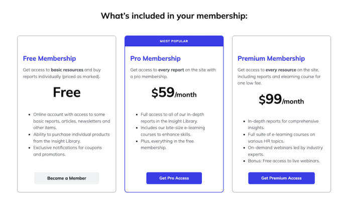
3. Is your pricing page easy to understand?
Creating a converting pricing page for your membership website requires clarity, transparency, and an engaging presentation. Start by clearly presenting each membership tier and listing the features that each plan offers. Use concise, compelling language to convey the member benefits, making it easy to compare options. The primary goal of a pricing page is to encourage visitors to subscribe to your membership website. Don’t include links or other elements that lead away from the conversion path.
Incorporate a testimonial banner to build trust. Ensure that your call-to-action buttons stand out and guide users toward the sign-up process. By prioritizing user experience and highlighting the advantages of your memberships, you can design a pricing page that effectively converts visitors into loyal members.
4. Do you have any errors or outdated information on your site?
A website with incorrect details, broken links, or outdated content can quickly turn potential members away. Broken links or missing images are not just frustrating; they can make your site appear neglected. If visitors sense you’re not maintaining your website, they’ll be far less likely to subscribe or engage. Regularly reviewing and updating your site is crucial for showcasing your professionalism and building trust with your audience.
Check if these pages and links need an update:
Are your contact details still accurate?
Is your "About Us" page current?
Are your social media links still functional?
Why a clean website design shows commitment
Revamping your membership website design is crucial for and staying relevant and competitive. A modern, intuitive design can attract new members and retain existing ones by making it easier for users to access valuable content. An updated design reflects your commitment to delivering a high-quality user experience, showing members that you prioritise their needs and satisfaction.
When building a membership website, you don’t have to go it alone. There’s a wealth of free web tools and online resources available to take advantage of to improve your design, optimise for SEO, deliver content, investigate usability issues & much more.
Once you build your membership site and launch it, that’s just the beginning. A membership website is definitely not a “set it and forget it” kind of project. The whole idea is to keep it current, active, and keep your members happy and continuing to buy your information or service, right? But how do you do that? The answer is email marketing.
Email newsletters are a critical tool in the armoury of every online publisher. They should be used both in the sales process and to build loyalty. Therefore if you find that a lot of your emails are not being delivered you must take the time to understand why.
If you're a coach, trainer, adviser or expert offering membership options, stepping into the world of email marketing, choosing the right platform can feel overwhelming. The good news? You don’t need all the bells and whistles to get started — but you do need a tool that supports your growth.
You've poured time, energy, and passion into building your membership site. Your content is solid, your offer is clear, and you know the value you provide. So why are some visitors still hesitating to join?
The answer often comes down to one word: trust.
And one of the most effective ways to build trust online is through testimonials — real stories from real members who’ve experienced results.
Converting website visitors to paying members is of course, one of your primary goals as a membership business owner. There are many factors involved in making those conversions, but one method that could put you on the fast track is to provide a lead magnet.
Too many choices can overwhelm customers. Keeping your pricing options simple and clearly defined increases conversion by removing friction and reducing confusion.
Learn five high-impact strategies to boost user engagement on your website homepage, build trust and turn passive visitors into active customers. These practical tips are easy to implement will help you optimize your homepage for maximum results.
If you’re a yoga teacher attracting local students to your studio, you may be looking for opportunities to generate more income from your business. You may already have an online presence - a website, Facebook & Instagram postings, maybe even TikTok videos. But an online presence doesn't necessarily equate to an online business.
Identifying your customer persona, buyer persona or target audience profile, is crucial before launching a membership website. Understanding who your audience is allows you to create targeted marketing campaigns, improve user experience, develop relevant content, optimise pricing strategies, and foster long-term growth.
Are you ready to transform your knowledge into a thriving online business with a membership website but don’t have the time or skill to build it yourself?
Many people, with an expertise to share, are turning their knowledge into income by selling access to it using a membership website.
By putting your knowledge behind a paywall, you can turn it into a recurring revenue stream through the sale of memberships, courses, digital downloads and pay-per-view content.
Do you have an expertise to share but aren’t a web designer? Let our expert build your membership website.
Your site will be built using SubHub’s membership website builder
SubHub is an all-in-one membership platform that specialises in providing all the functionality you need to build, manage and grow a knowledge business. There’s no need for plugins or complex setups. Everything is in one place. SubHub makes membership easy.
Your site will include all the built-in features the SubHub platform has to offer - subscription levels, integrated payment gateways, course creator, landing page builder, forum, member directory, store and more.
What our design service includes:
Our design service will deliver a professionally-styled, secure and mobile-friendly membership website designed to convert visitors into paying subscribers for only $750 USD.
We’ll design an engaging public homepage to match your brand and showcase the benefits of your offerings and a member's homepage for when subscribers log in.
Intuitive and user-friendly navigation menus will be created so your visitors and members can easily find the content they're looking for.
Your content will be organised and enough will be uploaded to launch your site. We can even create bespoke interior pages.
After you provide content and visuals, our expert will then build your mobile-friendly website to showcase your brand and communicate your expertise.
We’ll send recorded run-throughs of the work in progress so you can provide your feedback.
We even record individual tutorials so you’re comfortable and ready to manage your website on your own.
SubHub is more than just a software
Our commitment to you doesn’t stop after we hand over the website to you. You’ll continue to receive outstanding support from our 5-star team which always impresses our clients with their dedication. We don’t send scripted replies but thoughtful information along with screenshots and bespoke video tutorials.