Learn how color converts website visitors to members
Color is a visitor's first point of engagement with a website. This makes choosing the correct color scheme for your website an essential design decision. Not only do color choices create brand awareness, they actually trigger specific emotions and influence conversion rates.
A user’s opinion of a product is formed by their interaction with its color - which can positively or negatively impact their engagement. Color can be a deciding factor in whether a visitor keeps browsing a website or leaves after a few seconds. This is why, it’s important to learn how to communicate with color.
What is color psychology
Color psychology is the study of how colors can affect people's perceptions and behaviors. Studies have shown that certain colors can impact on product performance by influencing a consumer's impression of a brand. Research suggests that a person makes a subconscious product decision within 90 seconds and that 62% to 90% of that assessment is based on color alone. It's no wonder that marketing and branding agencies always take color into account when they consider how to persuade a consumer to make a purchase.
Color has always been a part of the human experience. While we don't exactly know how color associations develop, we do know that color can evoke emotions, inspire reactions and change modes of thinking. Through color, we express and communicate to others about what we are feeling.
By applying the basic principles of color psychology, you'll be able to choose the best color palette for your website.

What does each color say
Consider what emotions you want your visitors to experience and associate with your website and then employ colors which promote those responses. By choosing a website color palette that reflects the values, goals and aspirations of your potentials members, you'll connect with them on a psychological level.
If you want to establish a sense of trust, choose blue. If it’s optimism, select yellow. Red represents energy. Black is symbolic of luxury. Green equates growth and tranquility.
Color surveys also demonstrate that gender plays an important role in color preferences. Studies show that women prefer blue, purple and green but not orange, brown or gray. While men respond positively to blue, green and black but not purple, orange and brown. Be sure to evaluate your palette choices according to the gender of your audience.
Chromatic harmony creates an enjoyable user experience. Avoid color overload which causes a feeling of confusion. Today’s design trends emphasise a limited palette of 4 to 5 colors, balanced with plenty of white space for a sense of expansiveness.
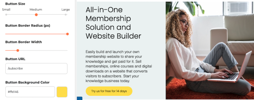
Learn to use color strategically. Conversion is increased by isolating a bright colored call-to-action button with white space - the contrast focuses the visitor’s attention on the CTA.
Logos can often dictate a website’s color scheme. But if you’re floundering to compose a balanced palette, there are plenty of color palette generators that can serve up stunning color combinations.
How to choose the best colors for your website
- Understand your brand identity: Your website's colors should align with brand's personality, values, and mission.
- Consider your target audience: Understand the demographics and preferences of your target audience.
- Use color psychology: Leverage color psychology to evoke specific emotions. For example, blue is often associated with trust and professionalism, while red can convey energy and urgency.
- Start with primary colors: Choose a primary color palette that represents your brand.
- Ensure contrast and readability: High contrast between text and background is crucial for readability. Choose colors that ensure text is easily readable.
- Additional colors for variety: Introduce additional colors to add variety and interest. These can be used for secondary elements like borders, icons, or backgrounds of specific sections.
- Use a limited color palette: Avoid using too many colors, as it can create a cluttered and confusing look. Stick to a limited color palette to maintain a cohesive and harmonious design.
- Font color considerations: Ensure good contrast between text and background colors for readability.
Tools to help you pick a color palette for your website
With Coolors, all that’s necessary to generate the perfect color palette for your website, is a press of the spacebar. Or you can enter a hex value as a starting point. It’s that simple.
Material Palette prompts you to select two colors and then creates a palette of eight colors based on those choices. It also delivers up suggestions for the placement and use of each color from primary to accent, from text to icon.
Easily create a color scheme based on an image with Canva’s color palette generator. Just upload your image and a palette of five colors will be produced. Or explore color combinations with their Colors tool by typing the name of a color in the search bar and then exploring the hundreds of color combinations delivered up.
For inspiration, browse through the curated palette collection at Color Hunt. Having been reviewed and hand-picked, its homepage features the very best of its user-contributed color combinations.
Colormind uses AI to generate color palettes based on the colors you choose. You can upload an image or start with a base color and let the tool generate a palette for you.
The traditional alternative to using a palette generator is to use an artist's color wheel.

How to choose a website palette with a color wheel
The color wheel is a visual representation of colors, with hues arranged according to wavelength. Interestingly, it was Sir Isaac Newton, the 17th century scientist, who mapped the color spectrum into a circle and created the color wheel.
The color wheel geometrically represents the relationship between primary colors, secondary colors and tertiary colors. It allows you to match harmonious color combinations based on the position of the colors on the wheel.
For example, complementary colors are opposite each other on the wheel - like red and green, orange and blue or yellow and purple. Complementary colors always work well together as they balance each other visually.
You can also create a monochromatic website color scheme by selecting variations of a single color from light to dark shades.
An analogous color scheme is created using colors found side by side on the wheel. This is because neighboring hues share the same base color.
Conclusion
Color is only one element in designing a website but its ability to visually and emotively communicate is profound. Make sure that you don’t miss this opportunity to engage with your audience by choosing the best colors for your website.