Website design elements continue to evolve and it's important to stay on top of them. If you haven’t updated your website in a few years, then it's time to give your site a refresh. Don't let your site look stale and outdated. We highlight eleven web design tips you should consider implementing in 2023. Even applying just a few simple updates can make a visual impact.
Bold Colors
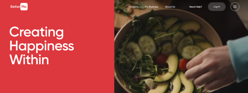
Your website gets one chance to make a good first impression, and what other way to do so that incorporating bold colors.
While many websites tend to play it safe with color and saturation, showing off fun colors is a great way to display your brand’s forward-thinking, outside-the-box, and eccentric personality.
Not only do color choices, create brand awareness, they actually trigger specific emotions and influence conversion rates. When making your color choice, consider what emotions you want to elicit from your visitors.
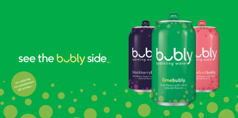
On their homepage, Bubly uses color to reinforce their brand and showcase their product.
Cartoon Drawings
An illustration can add a unique sense of character to a website. While high-resolution imagery and photography may work for some brands, hand drawings can be used to give web pages personality, as it’s outside of the norm.
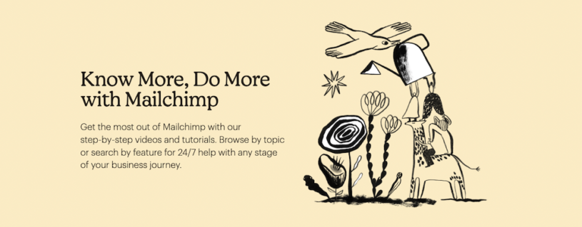
MailChimp uses quirky illustrations to personalise and differentiate their brand.
Animated elements
Animated elements can add personality to your site while engaging visually with visitors. With all the advances in web design technology, it's now possible to add animation without hiring a graphic designer.
Using the online graphic software, Canva, you can apply a range of basic animation effects to add motion to your designs such as fade, slide, bounce and more.
But before adding any animated effects, it's important to consider the purpose of the website and the specific goals of the design. Animated effects should enhance the user experience and not detract from it.
While animation can be exciting, it's important not to overwhelm the user with too many effects. Keep animations simple and subtle, and avoid using too many different types of animations on a single page.
Clear Call to Actions
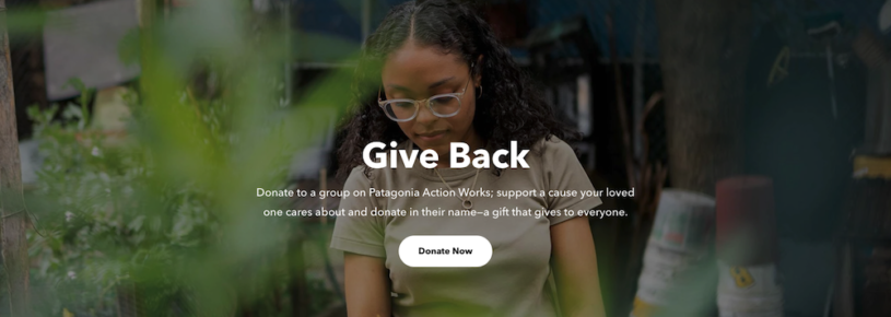
The goal of any website is to provoke action. Your website should make it as easy as possible for your customers to find the information they’re looking for.
Patagonia does this impeccably with its call to actions on its activism page. A grey overlay on the banner image gives the white pill shaped donate button a visual pop.
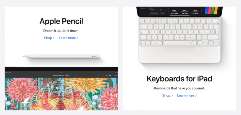
Large Typography
Typography is certainly not a new web design element but how you use it can be considered different for 2023.
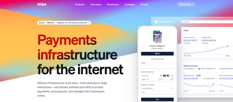
Bigger and bolder typography are the trend for this year. An oversized use of typography can create a long-lasting impression for visitors and ensure that what the text says isn't overlooked. Making typography the focal point can engage website visitors more than an image. But it's important to get the right balance between size and scale.
On Stripe's homepage, its large headline immediately informs any visitor of the company's offering.
Scroll effects
Parallax scrolling effects are a way to take website visitors on an imaginative journey. Rather than a static experience, scrolling effects can be used to continue to engage with a visitor as they move vertically or horizontally through a web page. It's a great way to add depth and movement to the browsing experience.
Parallax scrolling uses a web technique that involves designing different layers of content or backgrounds which move at different speeds. It is based on the optical illusion that we perceive distant objects as moving more slowly.
Keep in mind that any effect should always be meaningful to both the visitor and the design.
Informative Video
When the sharpest images and the most informative text just won’t get the job done, it’s time to give your web page a video to enjoy.
While most website visitors may not take the 90 seconds it takes to read a block of text, you’ll find that some are willing to watch a 90-second video. Whether the video is explaining a product in more detail, convincing a potential customer to buy a product, or helping to explain the idea behind a product, there is so much that the right video can do for a brand.
Need some tips for adding a video to your website? Make sure it’s short and sweet, and no longer than five minutes, as you’ll lose the attention of your customers. Also, make sure it’s relevant to your brand and kept relatively simple.
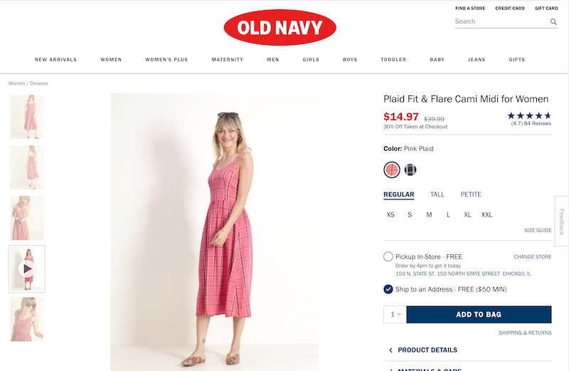
A great example of a brand using video to showcase products is Old Navy. When you view certain clothing items, you have the option to watch a video of a model wearing the specific item, so you can see it from the front, back, and in motion before purchasing a product online.
Chatbots
Artificial intelligence is all the rage.
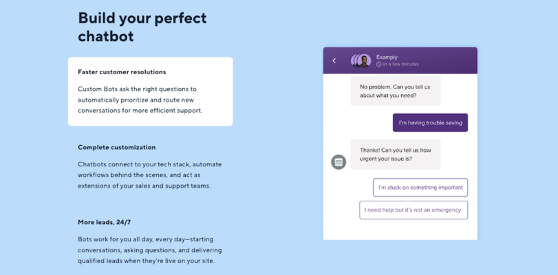
A visitor to your website may need support and have questions of all kinds. Chatbots are a conversational piece of software powered by pre-programmed responses or artificial intelligence to answer questions without the need of a human operator. They can collect a database of frequently asked questions and then respond immediately to interested users.
Not only are chatbots relatively cheap, but they also respond instantly and are available to your customers 24/7. They can complete an order, help with registration, make a reservation, deal with complaints, or even restore an account.
Split-Screen Layouts
Many designers are experimenting with symmetrical designs. A split screen layout is ideal for websites that wants to evenly combine copy and imagery. By vertically splitting the screen, you can create a perfectly balanced layout. This division lets each half express its own unique idea or express the same idea from two perspectives.
To add visual interest to a split screen effect, consider incorporating motion into one half. The best split screen designs provide a strong visual experience and multiple entry points into content.
White Space
The concept of utilising white space isn’t anything new, but it’s still an effective way to attract attention. It’s a common misconception that white space is just “empty”, but that's not the case. It’s also important to consider that white space doesn’t technically have to be white, it can be any color, texture, or a background image.
White space creates a visual hierarchy between content on the page. It orders and organises page elements and helps to attract users to key parts of your site like call to actions.
In terms of web design, this minimalistic and stripped-back approach continues to be a mainstay in design in 2023.
Apple is practically synonymous with how to use white space beautifully in every aspect of design. It's present in their complete product aesthetic from product design to packaging to store interiors. They understand how white space heightens the focus of a user. Sometimes, less is more.
Rounded corners
Rounded corners are everywhere in website design from image edges to button shapes. As with color choice, the shape of corners can influence a visitor's response to your website. Rounded corners can add a softer and more approachable feel to a design. They are psychologically associated with a sense of safety and friendliness.
A CTA button with rounded corners can actually influence conversion. Rounded corners, by drawing focus to the center of the container, direct a user's attention to act. Whereas square corners draw the attention away.
Start creating
Whichever new design elements you decide to implement for 2023, the bottom line is to have fun with it. Think outside of the box when it comes to the design of your website, while always making sure you have to keep the user front-and-center.
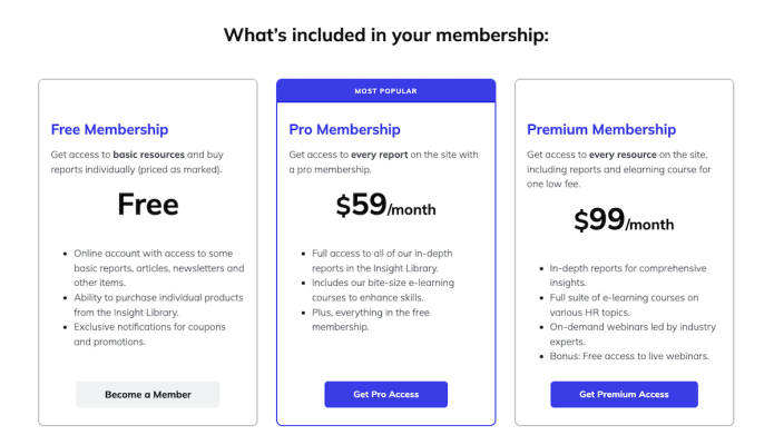
Now put these tips into action! Get started building your own membership website with our FREE 14-day trial.
Mara is a Senior Content Marketing Specialist at G2. In her spare time, she's typically at the gym polishing off a run, reading a book from her overcrowded bookshelf, or right in the middle of a Netflix binge. Obsessions include the Chicago Cubs, Harry Potter, and all of the Italian food imaginable.